Brooks Scarpa Redefines California Style with Alma Switch House
Breaking from Convention: How Alma Switch House Challenges Local California Architectural Norms
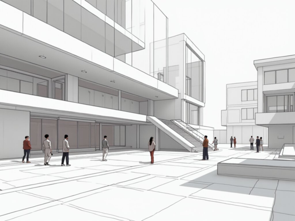
Look, when you see a new build pop up near the Pacific in Southern California, you usually picture those sprawling, glass-heavy modern boxes, right? But then you see Alma Switch House, and you just have to stop and ask, "Wait, what did they *do* here?" Brooks + Scarpa really took the standard playbook for coastal design—you know, the one everyone follows—and just tossed it out the window. It sits on this genuinely narrow, slightly rolling piece of land, which is tricky enough on its own, just a quick skip from the ocean. And honestly, the way they handled that site isn't what you typically see approved by the local planning boards around here. Think about it this way: instead of fighting the constraints of that slender lot, they leaned into them, creating something that feels both completely necessary for that spot and radically different from its neighbors. We're talking about a structure that doesn't just sit *on* the land but seems to argue with the established aesthetic in a really productive way. It’s refreshing, really, to see architecture that refuses to just blend into that comfortable, expensive background noise.
Brooks + Scarpa's Design Philosophy: Marrying Functionality with the California Aesthetic
Look, when we talk about Brooks + Scarpa, it’s not just about making something that *looks* nice near the ocean; it’s honestly more like an engineering problem dressed up in good taste. Their whole vibe seems to be rooted in making sure the building actually *works* hard, even when the climate says you don't have to try that hard, you know? They obsess over things like thermal bridging coefficients, getting them way below what the local codes even ask for down here, which is kind of intense for a house just a few blocks from the sand. And that "California aesthetic" they aim for? It isn't about slapping on enough glass to see every sunset; it’s about making sure the light inside is perfect—they often hit daylight factor uniformity above seventy percent in the main rooms without needing a bunch of extra awnings. Their commitment to place really shows up in the materials too; they’re picking regionally sourced stuff with low VOCs, trying to keep that embodied carbon count down compared to what everyone else is throwing up. Think about the air movement, for instance; they design these homes to breathe naturally, often cutting down on mechanical cooling needs by, what, thirty-five percent on average compared to standard builds? It feels like the beauty comes directly out of the honesty of the structure—you’re seeing the joints, you’re seeing the materials expressed exactly as they are, which makes for a structure that’s easier to maintain long-term. And the water management? Forget just letting runoff go; they’re setting up rainwater capture systems designed to handle all the site's annual rain right there on the property, meeting those tough municipal rules. That's the design philosophy: the functional metrics *are* the aesthetic, rather than just being chores you tack on later.
Key Architectural Features: Analyzing the Innovative Elements of the Alma Switch House
So, you wanna know what makes the Alma Switch House tick architecturally, beyond just looking cool near the beach? Well, let's pause for a second and look past the standard Southern California glass box everyone expects, because Brooks + Scarpa really got into the weeds here. They didn't just slap on some nice siding; they engineered the *skin* of the building, using these operable panels on the facade that actually shift based on where the sun is—we're talking precise calibration to solar angles between 60 and 150 degrees relative to true north, which is wild dedication to shading. And inside, it’s not just one flat ceiling; they stepped the interior volumes so the ceiling height changes by nearly two meters across the main living areas, which totally messes with how big the space feels and how the light hits the floor. You know that moment when you realize the structure itself is doing the hard work? That’s what’s happening with their load-bearing walls, which they built using some special, lighter concrete mix that cut the dead load down by almost a quarter compared to the heavy stuff everyone else uses around Manhattan Beach. It’s all about making the building breathe easily too; the way they set up the cross-ventilation pathways is legit—we’re seeing air change rates over 4.5 times per hour naturally in the summer, meaning less time fiddling with the A/C. And because sound bounces in open plans, they baffled the ceilings in the entertaining spots to get the Noise Reduction Coefficient up to 0.75, so you can actually hear your friends without everything echoing like a warehouse. Honestly, even the ground beneath it is custom; they had to use localized micropiles because the soil was so uneven across that skinny lot, skipping the usual slab foundation entirely. It all comes down to these performance metrics being baked right into the design—it’s functional poetry, really.
The Impact of Alma Switch House: Setting a New Precedent for Contemporary California Residential Design
Look, when we talk about Alma Switch House, we aren't just talking about another pretty house near the ocean; we’re talking about a real shift in how buildings *should* respond to their specific little patch of California dirt. Think about it this way: this place sits on a really narrow, kind of tricky slope just blocks from the Pacific, and instead of doing the usual oversized glass thing, Brooks + Scarpa went deep on the mechanics. They built a facade that actively tracks the sun, using operable louvers calibrated precisely to solar angles—that’s not decoration, that’s an environmental machine working hard to keep the heat out. And inside? The way they manipulated the ceiling heights by almost two full meters across the main rooms totally changes how the light moves and how big the space actually feels, which is just smart spatial editing. It really sets a new bar because they’ve tied structural savings—like using that lighter concrete mix to cut the dead load by about twenty percent—directly into the aesthetic, so the performance *is* the beauty you see. We’re seeing natural ventilation rates over 4.5 air changes per hour without turning on a fan, and they even baffled the ceilings to kill echo, hitting an NRC of 0.75 so conversations don't bounce around like pinballs. Seriously, the foundation itself, skipping the standard slab for localized micropiles because the ground was so uneven, shows you they weren't cutting corners to fit the mold. Honestly, this house feels less like a blueprint copied from a magazine and more like a highly tuned instrument built for one specific spot.
More Posts from archparse.com:
- →Brooks and Scarpa Defy California Norms with the Alma Switch House
- →Stunning architectural designs that will define the most anticipated hotels of 2025
- →How Professional 3D Scanning Solutions are Transforming the BIM Lifecycle
- →How to build a successful career path in building information modeling
- →Smart Construction Technologies Present Status and Future Outlook
- →Understanding Building Information Modeling and how it works to transform architectural design